|
Title: Falling Notes
Size: Date: December 2023 Medium: Digital Animation Falling Notes is a digitally created animated video created to serve as a backdrop for a concert stage. The piece is generally focused around the theme of music and branded for the recipient of the piece, the benefit concert Joey's Song. The piece is generally inspired by neon signs and the works of Keith Sonnier. The piece is meant to act as a complimenting but not overly-distracting part of a show that can serve as a backdrop for a wide variety of music and musical genres.
|
|
Inspiration
|
This piece was in part inspired by the work of Keith Sonnier and his neon, mixed-material sculptures. Sonnier utilizes a wide variety of materials to create unique arrangements in space and light. His work is incredibly conceptual and experimental, usually abstract in nature. Neon is the major defining quality of his work, being used in conjunction with other materials and mixed media to create unique and dynamic compositions. His art has been described as playful and post-minimalist, often having simplistic abstract forms and an emphasis on vibrant colors.
|

Keith Sonnier, Lunar Slice, 2013, neon, acrylic, aluminum, electrical wire and transformer, 11' 1" x 9' 3-1/2" x 4" (337.8 cm x 283.2 cm x 10.2 cm)
|

Keith Sonnier, Lit Circle Red with Flutex Glass, 1968, glass, neon, etched glass, black electrical cable and transformer and rubber end caps, 59-1/2" × 60" × 12" (151.1 cm × 152.4 cm × 30.5 cm)
|
Planning
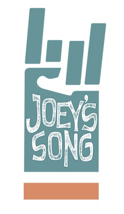
Joeys Song logo that I utilized for the creation of this piece.
|
The planning for this piece began with a request and several conditions to be met by the piece. This piece was to be some sort of animation or video piece to play in the background for the benefit concert called Joey's Song. The show takes place annually in Madison, Wisconsin to support epilepsy research, the piece I was creating was to be displayed in the back of the stage behind the performers. The requirements I needed to meet were to create a sort of non-specific video that could fit a wide variety of types of songs as well as be easily loop-able for as much time as necessary. I also was to create the piece around some sort of simple theme such as music, love, dancing, Wisconsin, or any broad topic of that nature. The topic I decided to go with was music since it seemed like it would be the easiest to thematically connect to the show itself and represent it in a non-complex manner. Once I had my theme I needed to start brainstorming further ideas for what I would actually create. I knew I wanted to do some sort of animation rather than video collage or other similar format, and with my theme of music I had a fairly good starting point. I needed to ensure that whatever sort of animation I created would not be overly flashy and distracting because it needs to compliment the performance rather than draw peoples attention from the performers and the music. It was for this reason I knew I would do something with a dark background and soon I decided upon the idea of falling music notes in an almost rain like pattern. The elements of the piece would be some vibrant color, and I wanted to utilize Gaussian blur and similar effects to incorporate some neon-like elements into the video.
|
Process
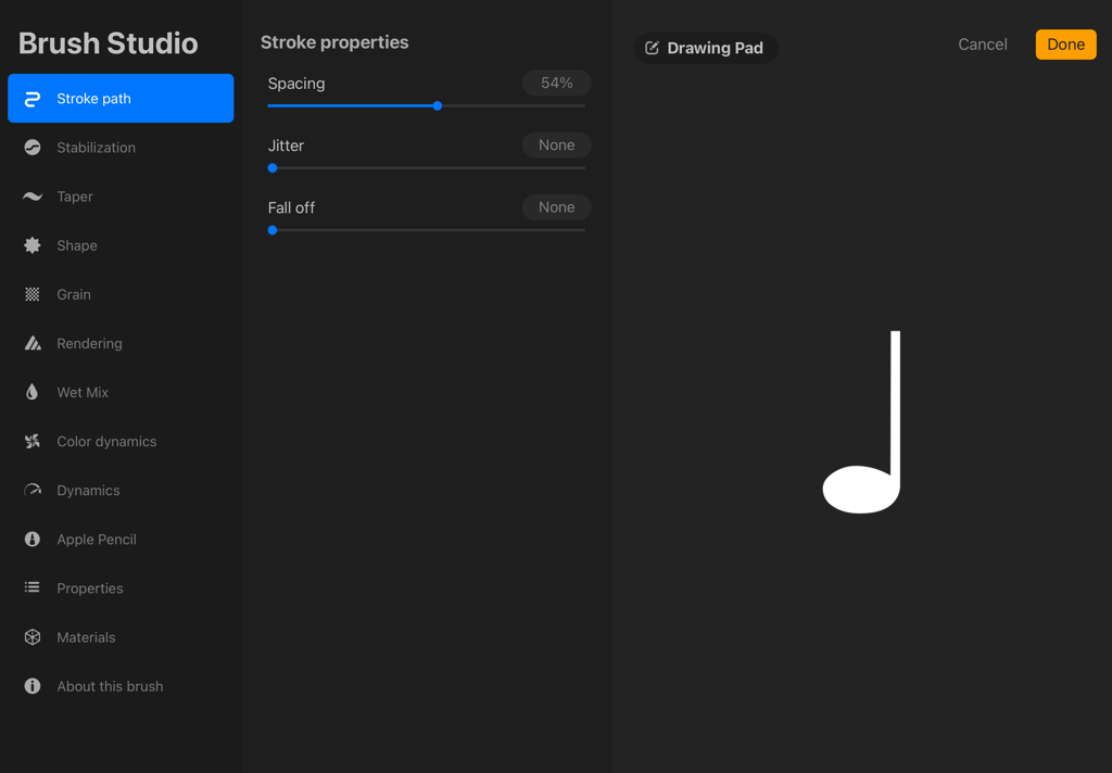
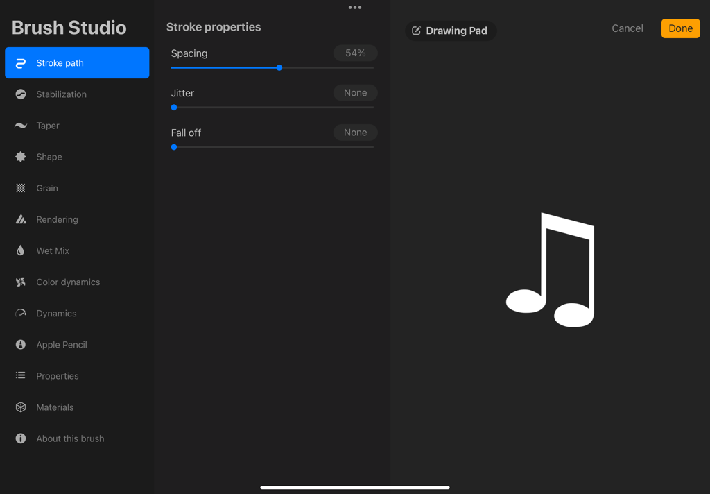
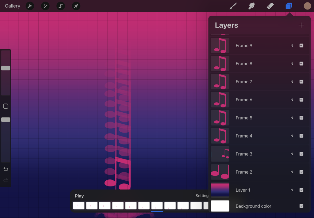
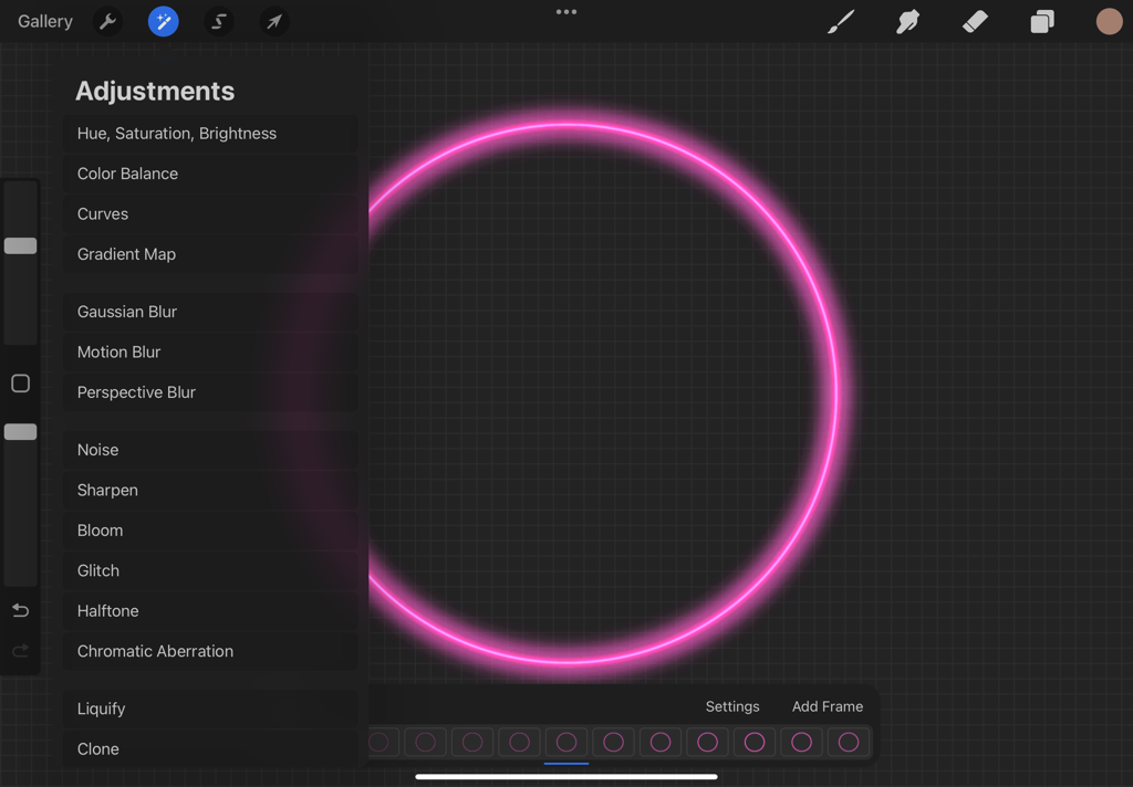
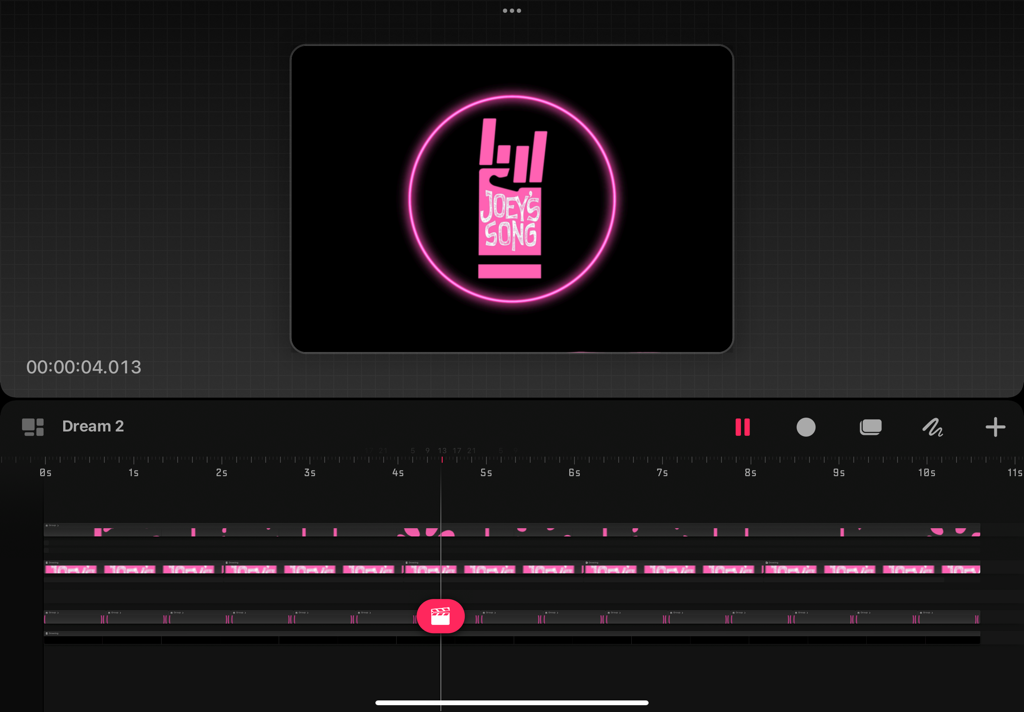
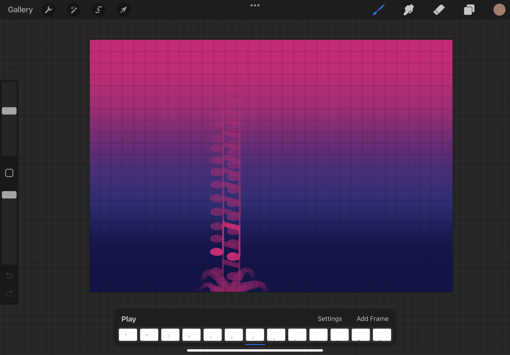
To begin, I first needed the shape of the music notes. I decided to create three different notes to fall during the video, an eighth note, double eighth note, and quarter note. For these, I created a unique stamp brush in Procreate, borrowing elements from the Adobe Creative Clouds asset library. I had initially attempted to draw such notes on my own, but they were time perfect and imperfect in their form so i simply decided to utilize the pre-made assets which I had already paid for access to. Once I had created my own unique procreate stamp brushes, I began the animation process. I created a series of frames in which the note began at the top of the screen and then each frame moved closer to the bottom. When it reached the bottom I created a short splashing animation, of something around only two dozen frames. I then repeated this process for each of the note types, creating three of these similar animations in total. I then grouped each of these together and duplicated them, changing the entire duplicated frame sets to different positions on the screen and ordering them in a unique pattern. This way an effect was created that made the notes seemingly randomly fall across the canvas. Once I had created this animation I began on a second animation, this one was more simple being a slowly flashing ring of neon. This animation was quite simple to create. I began with a colored ring, then utilized the Gaussian blur feature and excessive bloom filters to create a series of frames in which the bloom and blur slowly increases. This gave the effect of a simple neon light ring in which it slowly flashed every second or so. I was able to line this flashing up pretty close to the frequency of falling notes, which worked out well for the following parts of the process. From there, I exported both animation files from Procreate into a new program called Procreate Dreams. This new application is an animation specific program developed by Procreate and easily compatible with its files. I made sure to export them without backgrounds, so I could lay them over each other and over a dark background. At this point I also needed to fit their lengths so they would each be the same length and the video would have uniform elements throughout its duration. This involved duplicating the flashing ring video several times. From there I was able to manipulate things like the frame rate and perform necessary color corrections and other edits. I then added the final touch to my piece which was adding a version of the joeys song logo in the center of the neon ring. This logo was edited to color match the rest of the piece and was simply animated through Procreate Dreams to pulse alongside the other elements.
|
|
|
|
|

|
|
|
Experimentation
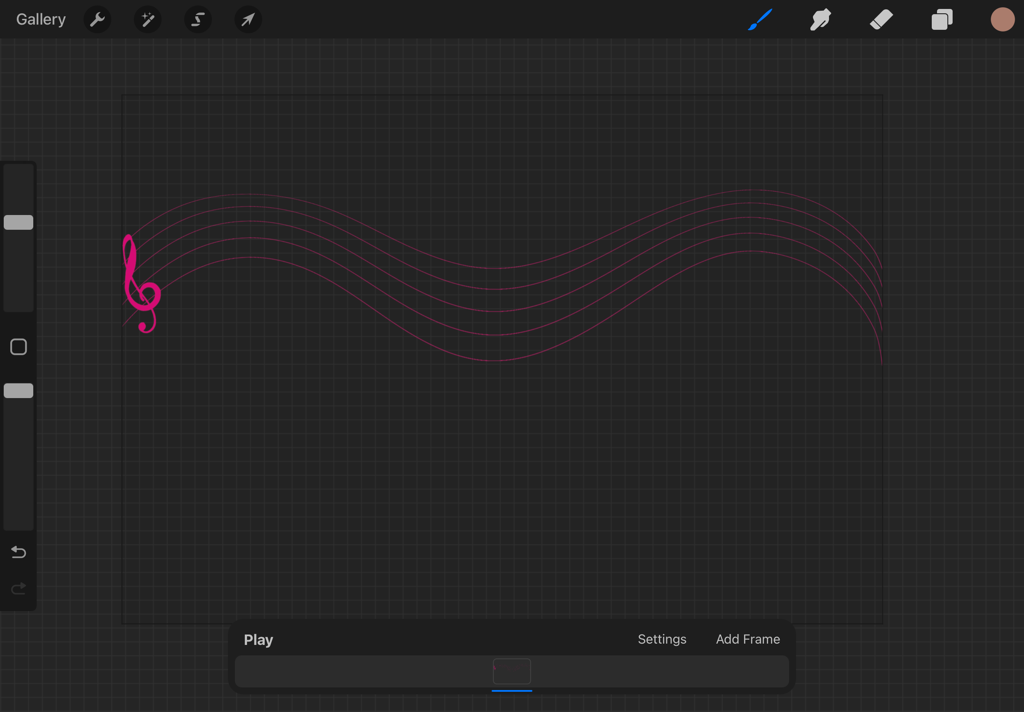
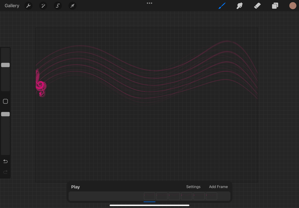
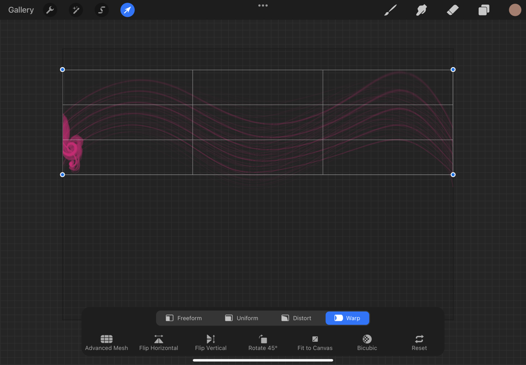
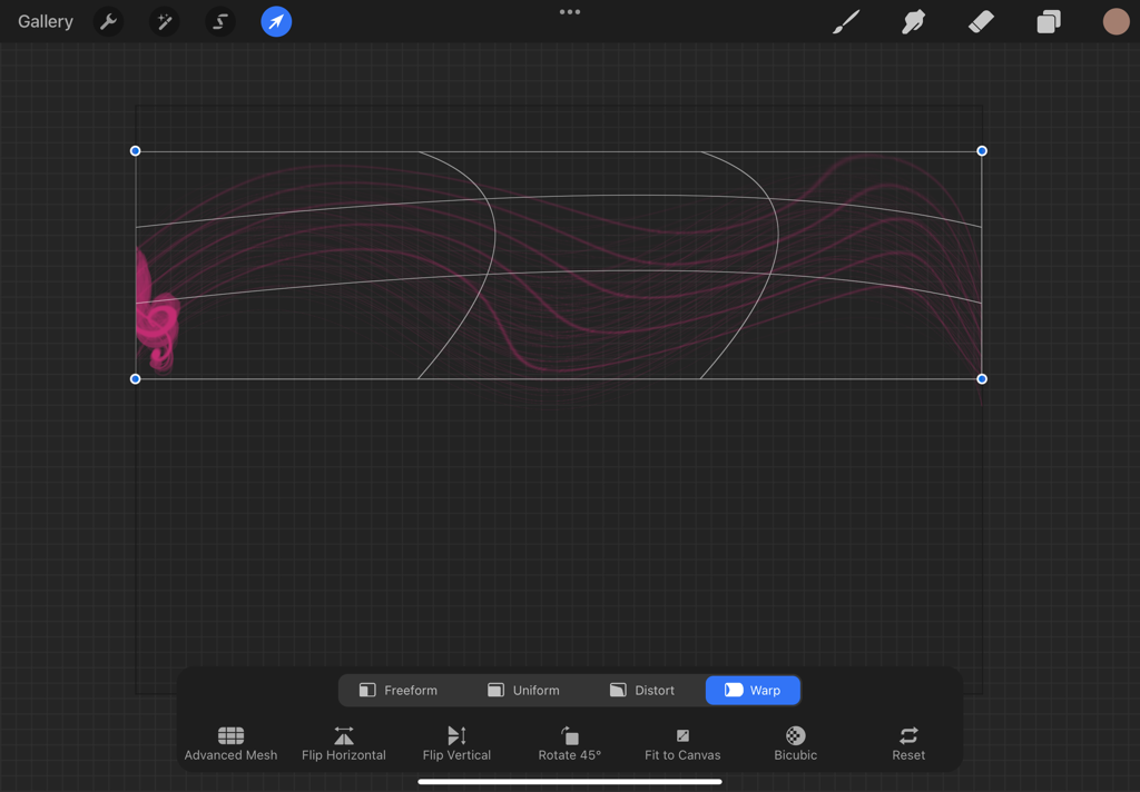
I experimented with several things throughout this process, the biggest of which was an unused animation based around the image of a music staff that was to sort of flow in the background of the video. This animation began to be developed but the method I was using turned out to be a failure and so I cut this element from the video. Basically, I was utilizing procreates warp tool to move the staff, without having to redraw a scale version each time. The first attempt I misjudged the movements for the animations and had to entirely redo them in order to achieve consistency and a loop-able video. The second attempt went better but I had trouble warping the image while maintaining distance between the lines in the staff and maintaining the shape of the treble clef symbol on the side. With the second attempt failed I came to the conclusion, I considered how well a music staff fit with my theme as I was unsure how this element that I personally associated with classical music would fit in a primarily rock concert. With this I came to the conclusion of cutting it from the animation entirely, instead coming up with the idea of the moving logo that eventually replaced it in the final piece. Another small experimentation worth mentioning was the short-lived gradient background that only existed for the first iteration of the first music notes animation. This element was cut shortly after the beginning of the animation due to its overly vibrant colors and lack of transparency, meaning I couldn't layer animations as well. While that second condition could have been remedied I eventually just cut it in favor of a simple black background that wouldn't be so distracting and overtake the rest of the elements.
|
|
|
|
|
Critique
|
Compare
There are two major similarities between my piece and the inspiring piece: the neon elements, and the abstract form. My piece is partially inspired by the neon elements found in Sonniers work, the circle used in my animation is incredibly similar to works like Sonniers Lit Red Circle With Flutex Glass. The other similarity is the fact that both the works are abstract in nature, though mine includes some defined shapes. Both works utilize simple and abstract forms as well as color and light to convey beauty to the audience.
|
Contrast
The biggest difference between the works is medium, my piece is an animated video while Sonniers work are three dimensional objects involving mixed materials and neon lights. Sonniers work is also more abstract than mine is, with more varying colors and forms. My piece involves a logo and clearly defined music notes which are two far more defined elements than in Sonniers work. My work also moves, being an animation while his is physically static and unmoving. Beyond that, material use is the last huge difference, with Sonnier utilizing unique materials and forms to create his objects.
|
Reflection
Throughout this process I think I greatly improved my skills both with animation and with Procreate and similar programs. A unique part of this project was the process of transferring it between mediums and file types as I tried to put the files into several different types of programs including Procreate, Procreate Dreams and Adobe premier. There were some challenges throughout the process also with uploading certain types of files since I am generally unaware of video formats and file types. This was my first animation but I think things went very well on the technical side of things. I also struggled with my ideation as I had some uncertainty about what the client wanted from this piece, luckily I was provided with some examples and a more clear explanation of what needed to be done. Besides my challenges I found many successes during this piece, I was surprised by how well my Procreate skills extended into the new Dreams application. I was also pleasantly surprised by the animation abilities of procreate as a program. Overall I think this project went well and while animation isnt my medium of choice, I feel more confident about completing animation projects in the future.
ACT
Clearly explain how you are able to identify the cause effect relationship between your inspiration and its effect on your artwork?
-The inspiring artist was the basis for some of the visual elements of my piece, specifically the use of neon effects.
What is the overall approach the author has regarding the topic of your inspiration?
- He is generally more abstract with his work than I am, mine included actual elements such as the logo and music notes that were not abstract in nature.
What kind of generalizations and conclusions have you discovered about people, ideas, culture, etc. while you researched your inspiration?
-I learned about Sonnier for the first time, I am always unsure of 3d work and sculpture so this was interesting to look at and apply to an animated medium.
What is the central idea or theme around your inspirational research?.
- the central themes were form, color, and shape. these were the basis that i used as inspiration for my work.
What kind of inferences did you make while reading your research?
- I practiced applying art principles across mediums which I honestly don't often do, transferring sculpture as an inspiration for an animation was a unique approach. normally my inspirations are the same medium as my final piece, maybe differing only in material not dimension.
Bibliography:
-https://www.pacegallery.com/artists/keith-sonnier/
https://www.nytimes.com/2020/07/23/arts/keith-sonnier-playful-sculptor-in-neon-dies-at-78.html
https://www.joeyssong.org/
