
|
Title: Feeling the Seasons
Size: 15 x 20 in medium: alcohol ink on illustration board date: march 2023 Feeling the Seasons is a re-imagining of Alphonse Mucha's lithographic print The Seasons. It is a reflection on the way our surroundings shape our identities and emotions and is meant to demonstrate how we react to our environments. The piece is an illustration made using alcohol ink based markers on illustration board. |
Inspiration
|
This piece is inspired by the Art Nouveau movement and The Seasons and Gismonda by Alphonse Mucha. Mucha is among the most famous names of the Art Nouveau movement. His distinctive style, beginning with his popular Gismonda, brought him to the top of the Paris Art world in the late 1800s. Mucha worked in a variety of mediums, but is most known for his posters and panels depicting his subjects in a style similar to that of Japanese woodcut prints. Mucha focused on creating art in different forms, so that it could be experienced and seen by a wider audience, extending beyond the limitations of most art forms at the time. He focused heavily on femininity believing it to be a representational opposite to the industrialized, impersonal, and masculine world.
Gismonda by Alphonse Mucha was the start of the artist's fame, this theater poster depicted the famous play of the same name, directed and played by Sarah Bernhardt. This close association with a well known actress is what brought Mucha into the public eye. This piece was the start of a contract with Bernhardt through which Mucha would produce many posters and promotional pieces. The Seasons (1896) was the first of Muchas popular decorative panels. It is a four panel representation of the seasons, personified as nymph-like women, each situated in a setting of their respective seasons. Mucha's choice to create a lithographic print was a reflection of his desire to make his art available to a wide audience. 
The Seasons (1896) by Alphonse Mucha
|

Gismonda (1894) by Alphonse Mucha
|
Planning
When planning the creation of this piece I was looking for something that would incorporate the ideas of identity, contrast, and the combination of modern and old. I began looking into the art nouveau movement as I thought creating an illustration based off of this movement would be quite interesting and unique. I was drawn in by Alphonse Mucha, particularly his work The Seasons. looking at the color and blending of Mucha’s composition I was immediately reminded of the look of alcohol-based ink markers. I was limited to a certain size of illustration board for this piece and I knew I would not be able to create all four of the panels seen in The seasons. I decided to only create two based off of the spring and winter scenes. I wanted to give the idea of opposites however I chose spring instead of summer because the summer panel did not give the emotions I was looking for and I did not want to use its composition. The theme I decided to work from was “how our surroundings shape our identities” and I decided this would be well represented by Mucha’s work. To fit the idea of combining old and new, I decided that rather than having the figures in the piece look mythological and from antiquity, I would place the figures in modern outfits, with the same similarly undefined environmental backgrounds of the seasons. To push this idea, I decided to put the winter figure in a modern winter jacket and give the summer figure a phone and earbuds.

|

|

|
Process
|
When beginning to create this piece I first needed to layout my page, I wanted to create a border emulating the framing that the original panels from Mucha's The Seasons are placed in. I used a ruler to first divide the page in two and then create small dots at the corners of the main components of the layout, I made a space for the illustrations themselves as well as a space for the french words for winter and spring (Hiver and Printemps). I tried to mimic the original for this layout, taking heavy inspiration from the ways the frame is divided.
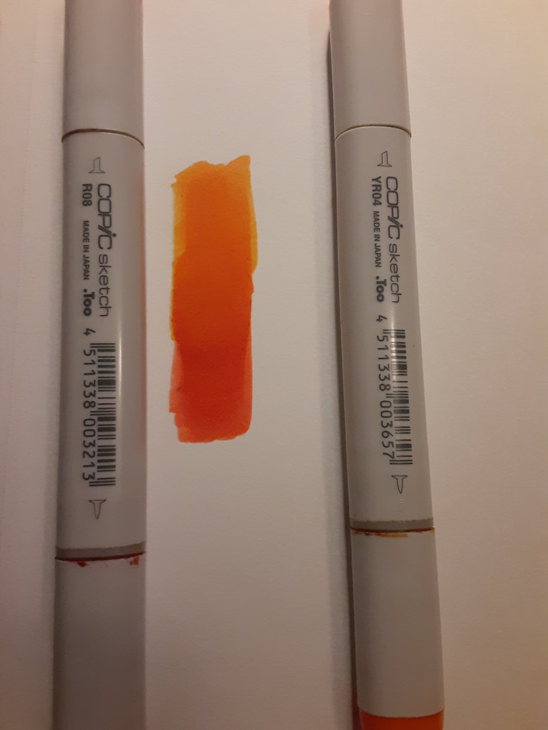
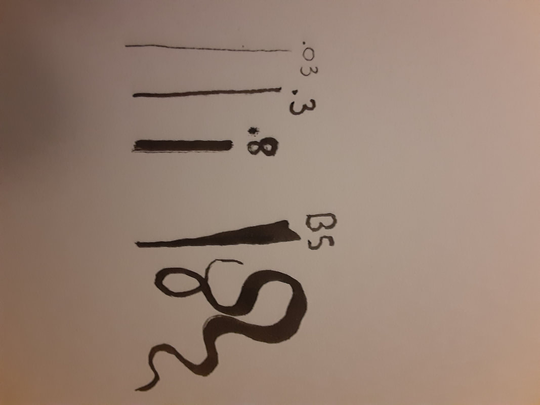
Once I had layed out the page, I began sketching the basic shape of the figures. I decided to make them standing in similar poses to the originals to further the idea that this was a re-imagining of Mucha's The Seasons. once the basic skeletons of the figures were complete I began detailing them and their clothing. Mucha's work is mostly defined by hard linework which I imitated for this piece attempting to adapt it into modern objects. I drew the women's dress and jacket as well as the rest of their clothing quite easily, the real challenge came with the background. Mucha's backgrounds in The Seasons are quite complex and abstract with many complex shapes and objects, I attempted to mimic these backgrounds but decided to simplify them to fit better with the figures. The spring background was quite simple, it was a tree with leaves rising from behind the main figure. The winter background was more difficult, in the original it is dominated by a large bush to the right of the figure, I attempted to create this foliage but it simply didn't look right. I experimented with size and orientation but in the end decided to scrap the whole Idea of the bush, deciding to instead opt for a background similar in layout to the spring one. The winter background is characterized by sharper edges than the spring background, with icicle like triangular designs forming a corona like design around the figure. Once I had completed the pencil outlines I began covering them in ink, for this I used black Copic multi-liner pens. I mainly used the brush pen as I felt I could create many differing line widths using the same pen. For straight long lines i used the .8mm pen as I needed a line of uniform width. As I finished the outlines I began the process of coloring the image, for this I utilized Copic alcohol-based brush markers. I like these markers due to their blending capabilities, as well as their smooth ink distribution and color accuracy. An issue I encountered while using these markers was that some of them had dried up. I have had them for a few years now but hadn't expected some of them to dry so quickly, especially considering I did not use the dried markers very often, and kept them capped in cool conditions. Luckily most of the markers I was looking to use were still in good condition, as only the Lightning yellow and Neutral Grey No. 8 had dried up fully. I first layed down a base coat of ink and then began building up sections such as the women's hair with other colors to give a gradient effect. Coloring it fully took several hours as many of the sections required going over multiple times with the markers. 
|


|
Experimentation
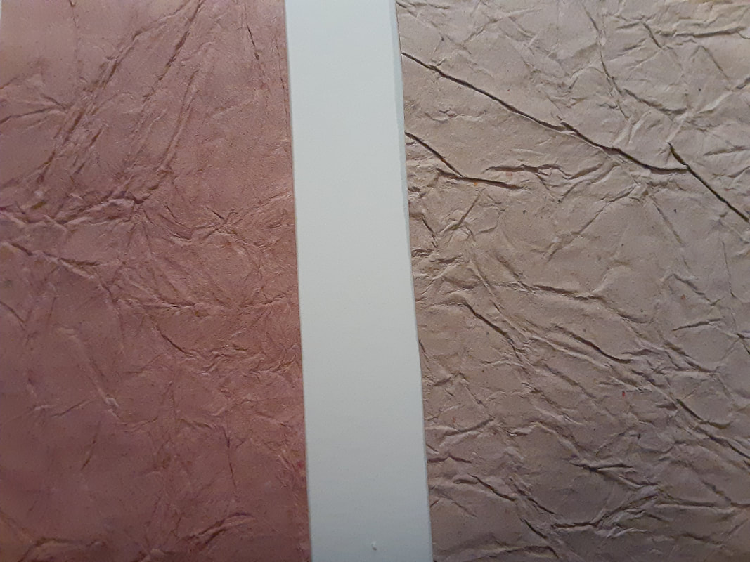
I mainly experimented with the medium I was using, testing the Copic marker's blending capabilities as well as the multi-liners and pencils. A major thing I learned from this experimentation is that the markers will smudge pencil or multi-liner ink if it's wet, this led to me erasing most of my planning lines when actually coloring during my process. Another thing I experimented with was paper, I initially mishandled the words under the panels and they were incorrectly labeled. To remedy this I decide to place paper over them, with the correct labels. I had a few different types of paper of varying color, thickness, and texture. I wanted one that was unique but did not take away from the rest of the piece. I eventually decided on a brown paper that had a unique almost crumpled texture.
|
|
|

|

|
Critique
|
Similarities
-Both my piece and Mucha's have similar strong line-work, complimented by blended colors to create the illusion of shape on a flat surface.
-Both utilize similar colors and shape to give the impression of the seasons and the feelings associated with them. |
Differences
-Mucha's works are prints while mine is an illustration made using markers. Mucha's medium allows him to easily make copies of his work and distribute them while mine is only a single piece.
-Another major difference is purpose, most of Mucha's works were advertisements or meant to tell a story or reference ancient mythology, while mine is meant to give the meaning of identity and the way ones environment shapes that. -My piece includes an illustrated frame, or a drawing meant to look like a frame. This differs from Mucha's pieces which are often in real frames. The frame I drew is based off of one that contains Mucha's The Seasons. |
Reflection
While creating this piece I feel like I got a better understanding of alcohol-based markers and the way they work when creating a larger piece. I have only used them for smaller illustrations so using them on a large scale was a learning experience. I also learned a lot about Alphonse Mucha as I had to research him and his history and works. It was fascinating to dig deeper into the Art Nouveau movement and learn the meanings and concepts behind it. A major struggle I had when planning this piece was actually finding a good theme to fit with Art Nouveau. It was hard for me to find artists who had actual meaning in their pieces due to the fact that Art Nouveau basically combined the ideas of fine arts and manufacturing/production, similarly to pop art, focusing heavily on copies and reproduction. My favorite part of this project was definitely the research, I had of course heard of Mucha but found myself really enjoying his art style which I was previously unaware of. In the future I want to create more works like this perhaps even finishing the two other seasons. I hope others see in my work the themes of Identity and the connection to one's surroundings, I also hope they notice the small details regarding blending and usage of color.
ACT connections
Clearly explain how you are able to identify the cause effect relationship between your inspiration and its effect on your artwork?
- My piece is a direct reimagining of Mucha's The Seasons, it shares composition and color with the original but varies when it comes to actual depiction of the characters, size, medium, and has some varying elements.
What is the overall approach the author has regarding the topic of your inspiration?
- Mucha often was commissioned or contracted by others to create work. Starting with Mucha's Gismonda, the artist was employed by Sarah Bernhardt to create several advertisements for her various performances.
What kind of generalizations and conclusions have you discovered about people, ideas, culture, etc. while you researched your inspiration?
- I was interested to find connections between visual art and other forms of art. This is seen in the fact that Mucha's Gismonda is based off of theatre, and many of Mucha's works are posters for various plays and other performances. I was unaware how connected visual arts and theater are and the way that those in each field work together often.
What is the central idea or theme around your inspirational research?
- A big part of Mucha's career was reproducability, his use of printmaking allowed his art to reach a very wide audience. This was a major part of his rise to fame and is one of the biggest benefactors in his career.
What kind of inferences did you make while reading your research?
-There are plenty of references to the inspiration behind the subjects in Mucha's work, for example Gismonda is based on Byzantine art. However there isnt much reference to the conceptual meaning behind Mucha's work, which makes it difficult to connect our themes and topics.
Citations
“Alphonse Mucha Paintings, Bio, Ideas.” The Art Story, https://www.theartstory.org/artist/mucha-alphonse/.
“Gismonda - Alphonse Mucha - Google Arts & Culture.” Google, Google, https://artsandculture.google.com/asset/gismonda-alphonse-mucha/7wHFNVmDw27e3A.
“The Seasons - Alphonse Mucha - Google Arts & Culture.” Google, Google, https://artsandculture.google.com/asset/the-seasons-alphonse-mucha/0wGgDn26QfijbA.
