
|
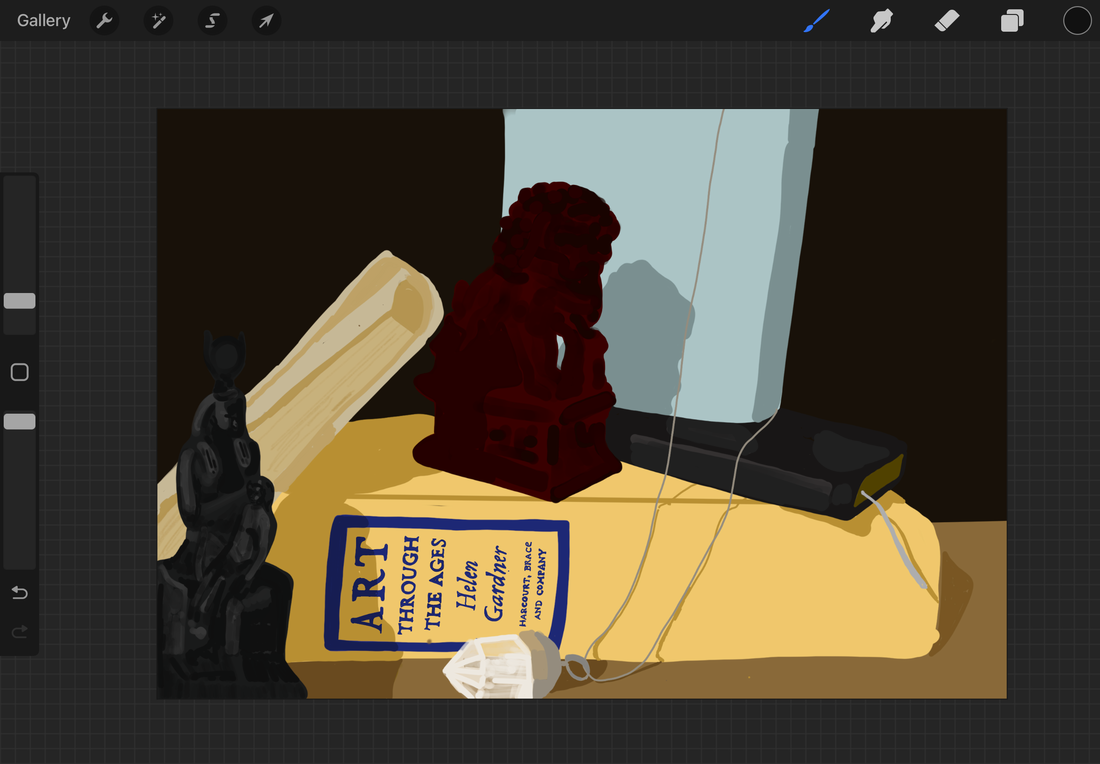
Title: Self Portrait
Size: 8.5" x 11" Completed: February 2023 Medium: digital painting Self Portrait is a digital still life painting inspired by the works of Paul Cezanne. It depicts a collection of objects, each with some importance or connection to my life or memories. The work is meant to be a personal representation of myself created through the use of inanimate objects. The piece seeks to invoke ideas of mystery and give the viewer a connection to memory and the concept of having sentimental value in objects.
|
Inspiration
|
My piece is inspired by the still life pieces of influential post-impressionist painter Paul Cezanne (1839-1906). In the mid 1870s Cezanne began focusing on the forms and color of his still life works and their subjects. He experimented with tone and color to create gradation and dimension in his objects. He rejected the idea of harsh contrasts between light and shadow, instead opting for subtle changes in tone throughout his pieces. Throughout his career he also experimented and eventually mastered composition and perspective in his still life pieces. Still life with Onions (1896-98) and Still life with Apples (1893-94) are two examples of his evolved use of perspective and form in still life compositions. This evolution is apparent when his later pieces are compared to earlier still lifes such as Bowl and Milk Jug (1873-77). The later pieces are more complex with more objects and less warped forms. The objects also clearly exist in the same space with effect on one another, this differs greatly from early works like Bowl and Milk Jug (1873-77) where Cezanne keeps the objects very separate with few forms in the piece and unrealistic or warped proportions and value.
My piece is inspired mostly by these later pieces and specifically their use of form and gradually changing tones to create a realistic composition. It makes use of multiple objects and attempts to highlight the shared space of the objects and their relations to one another. Light and color is also very important in my piece as I want it to feel dynamic and believable to the viewer while also making use of Cezanne's tinted pastel colors. 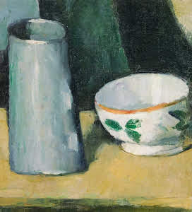
Paul Cezanne. Bowl and Milk Jug. 1873-1877
|
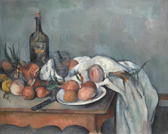
Paul Cezanne. Still Life with Onions. 1896-1898

Paul Cezanne. Still Life with Apples. 1893-1894
|
Planning
|
When starting this project I had just gotten an iPad Air for the purpose of creating digital art. I really wanted to use it to create a piece for class and I decided I would use it to paint some sort of still life. I didn't want to just do a basic still life, so I decided to create mine based on the work of Cezanne. I wanted this piece to be personal, and similarly to my others, focus on themes of identity.
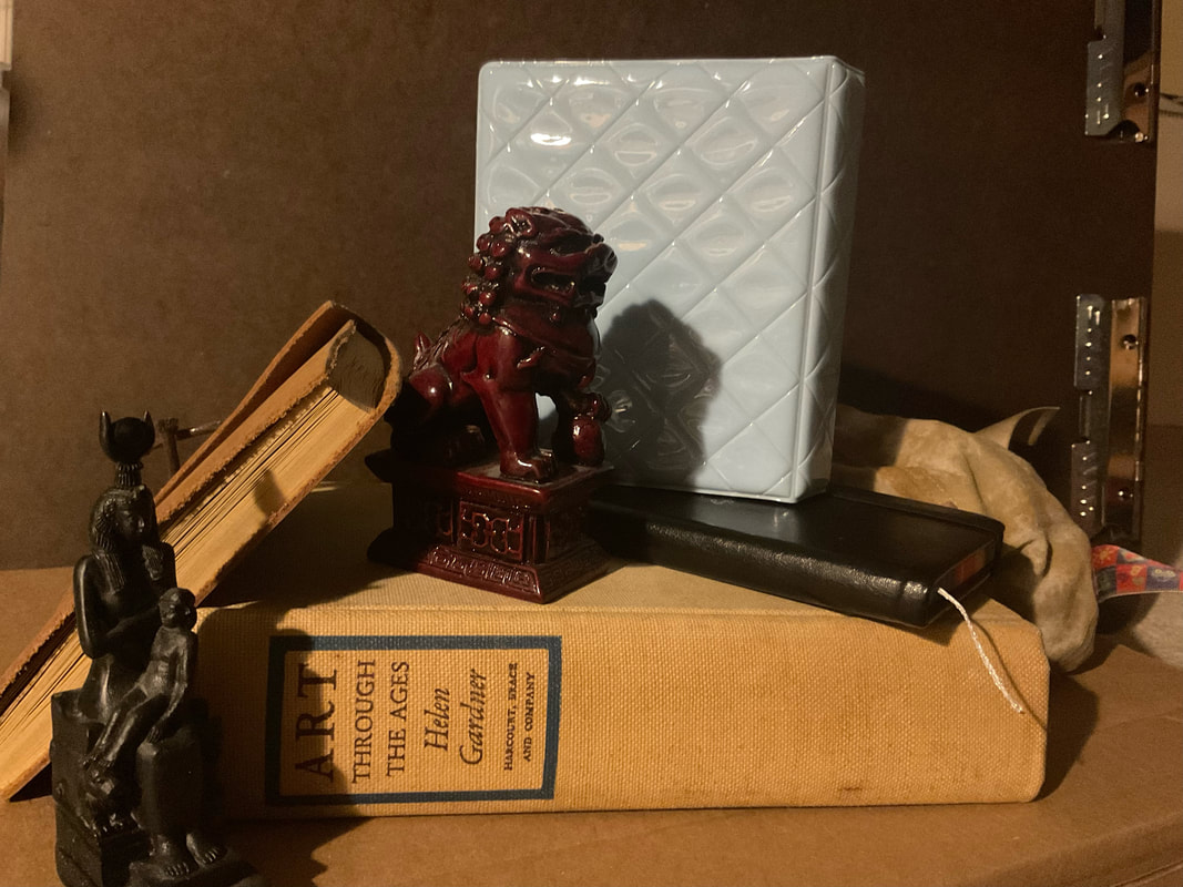
At this time I also began thinking about the still life's eventual layout and what it would include. While I could have used objects such as fruit or similar household objects similar to Cezanne's subjects, I couldn't really find an effective way to fit that into my theme of Identity. I then realized that I should do a still life representing myself, using objects important to myself. This would be essentially a self portrait made in the form of a still life utilizing inanimate objects. I then began searching for objects, I needed objects with importance and meaning to me. The first idea I had was to use the journal that I modeled in my Axiomatic Object a month or so earlier. The journal is one I got when visiting France with my family and I've been using it for over half a decade to record my experiences when visiting new cities and countries. I also used a necklace given to me by my younger sister and a little statue of a Chinese Fu dog or lion dog that my parents brought back from China for me many years ago. The statue was important to me because it represents the first time I can remember being away from my parents for over a week. Therefore it represents a significant part of growing up, as well as being something of importance to me due to being a gift from loved ones. |

|


Process
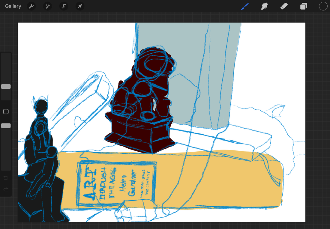
When beginning the creation process I knew I needed to do this based on observation. I set up the layout of my still life with real objects but realized i didn't have the space to leave out the setup for the duration of my process. I ended up photographing it and working from the picture rather than the actual physical objects. Doing this allowed me to get more precise shadows and lighting but in doing so I sacrificed the unique distortion of perspective that would be caused by me doing it purely through observation. I took a couple of different pictures because I was attempting to create the most visually pleasing composition and perspective for the piece.
I then began the actual process of digitally painting the work, I used an app called procreate on the iPad Air to create this piece, the app is very comprehensive with wide varieties of brushes and features that allow for very diverse creation. A challenge I faced due to my medium however was the fact that the iPad air is about two inches smaller in each dimension than the popular yet incredibly expensive iPad pro, which is about the same size as a sheet of paper. The screens small size meant that I had less space to work on, luckily the digital format allowed me to manipulate the rotation and size of the piece so I could work around this challenge.
I began my creation by making multiple translucent layers to paint on, I realized that painting the objects on separate layers would mean that I would be able to detail them individually without having to worry about affecting the other objects. I created a background, experimenting with gradients to try to give a realistic lighting effect. In my actual set up I used a large clipboard, meant for drawing pads, to create a dark background behind my objects. In the pictures, the clips of the board are still visible in the background, but I decided that I wanted the background to seem more solid and smooth, not seeming like a dark object but just the impression of a dark space beyond the objects. For each of the individual objects I began by creating a base color in their general shape which I would then add detail to later, I used a mid-tone so that I could keep much of the color the same, only using low opacity highlights and shadows to create the effect of a three-dimensional object. During this process I was really thinking about the colors I was using, wanting them to give the impression of Cezanne's tints.
I added shadows and highlights to my objects, attempting to make them seem believable in the space. The shadows were difficult as they crossed multiple layers and I had about a dozen layers of this piece. I constantly referenced the original picture as to make it look as true to life as possible. I decided to remove some of the finer details of the background and environment as I wanted to instead put my and the viewers' attention on the actual objects and not the space that they are in. I mostly used the medium smooth paint brush to create most of the objects, but I switched to finer calligraphy and pencil brushes for the details on the various books and journals. When I had fully detailed and colored the forms of the objects, I merged all the layers into one, ensuring that they were in the correct order.
|

|
|
|
|
Experimentation
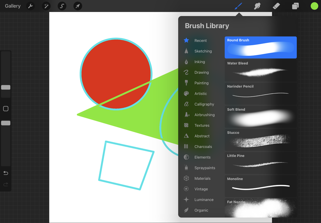
Before beginning the piece I experimented with many of Procreate's tools and features. I first began experimenting with color and brush types, I was surprised by the variation of their different brushes, some of which gave the effects of things such as water or light. I also noticed how the size of brushes and their opacity could greatly change their effects, simple manipulation of the brushes settings could alter the result to be almost unrecognizable.
Another thing I experimented with was the various tools such as gradient and blur. There were parameters you could set to alter the color and lines of either individual layers or the piece as a whole. I was unsure if this would be useful in my piece but I did theorize that it could be used effectively for the shadowy background of the piece.
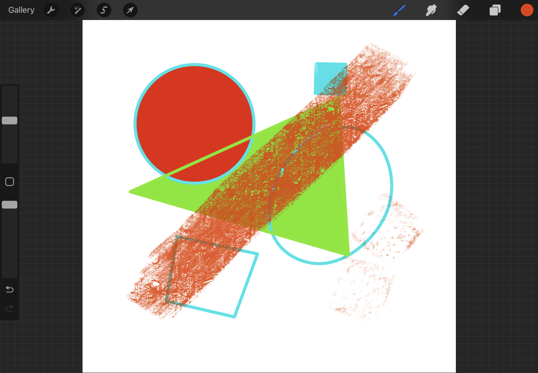
Other tools I experimented with were the color fill feature, where you could drag and drop large areas of color into outlines. As well as the shape tools, where you could create perfectly straight lines or accurate ellipses and polygons. Both of these tools became incredibly useful for the creation process as I used them to create the forms of each of the objects in my piece. I could use them to accurately convey spheres and straight edges without doing it purely based on observation.
Another thing I experimented with was the various tools such as gradient and blur. There were parameters you could set to alter the color and lines of either individual layers or the piece as a whole. I was unsure if this would be useful in my piece but I did theorize that it could be used effectively for the shadowy background of the piece.
Other tools I experimented with were the color fill feature, where you could drag and drop large areas of color into outlines. As well as the shape tools, where you could create perfectly straight lines or accurate ellipses and polygons. Both of these tools became incredibly useful for the creation process as I used them to create the forms of each of the objects in my piece. I could use them to accurately convey spheres and straight edges without doing it purely based on observation.
|
|
|
|
|
Critique
Similarities-Both my piece and the artists are still life based around an image of inanimate real-life objects.
-Both make use of a blending of values to give the objects a realistic shape. This technique was taken directly from Cezanne and as such they both share this quality. -Similar context's between the pieces, all are indoor scenes depicting realistic objects. |
Differences-Cezanne's pieces are oil paintings while my piece is made digitally using Procreate, this is probably the most apparent difference between the pieces.
-Another major difference is theme, my piece is a clear collection of unique objects with individual meanings while Cezanne's are mostly generic objects such as various types of fruit, glasses, or containers. |
Reflection
This creation of this piece was very interesting for me as it involved me working in a new medium that I find myself enjoying greatly. I found Procreate as a program to be very intuitive and easier to use than programs like Photoshop or Pixlr which I have used to digitally edit and collage photos in the past. While the program was quite simple, the actual usage of it took some time to get used to, on an iPad there is little to no texture on the screen and therefore there is little resistance holding the pencil in place. This was quite a difficulty for me as I found maintaining full control of the pencil to be somewhat troublesome. I later learned that there were screen coverings that could change the texture of the surface of the screen to avoid this problem, but by the time I had discovered this method I had already gotten used to the way the pencil felt. Another thing I found difficult was blending, I was unable to find a good way to blend colors on Procreate and due to me basing my work off of a painter this was an issue. The way I solved it was through using low opacity strokes and simply layering them over each other although it is not smooth and the lines where the colors intersect are still visible.
ACT Connections
Clearly explain how you are able to identify the cause effect relationship between your inspiration and its effect on your artwork?
My inspiration directly led my work to be a still life and affected my choice of colors and the texture/change in value throughout the piece. The stylistic choices in my piece are borrowed directly from Cezanne's work with his style in mind throughout its creation.
What is the overall approach the author has regarding the topic of your inspiration?
It's unclear whether the artist had a specific intention when it came to mood or the way the piece makes the viewer feel. He clearly was focused on technique and choices regarding style and the formal qualities of his work.
What kind of generalizations and conclusions have you discovered about people, ideas, culture, etc. while you researched your inspiration?
I discovered an interesting evolution in Cezanne's work, in my mind I always imagine artists as maintaining a style or level of skill due to most of their famous paintings being at the height of their careers or skills. It was fascinating to observe how Cezanne's style and skill evolved and got better as he continued painting still lifes. The unique details such as the way he blends colors, and his pastel tints are present throughout his work, but one can clearly see his evolution and eventual mastery of the techniques.
What is the central idea or theme around your inspirational research?
The central idea behind my inspirational research was my attempting to gather techniques and develop a style for painting from observation. My main focus when looking at Cezanne's work was attempting to dissect his creative choices and better understand why he chose to interpret objects in a certain way. I wanted to know why he didn't just paint things like they were realistic and I discovered that he wanted to give an accurate idea of the objects without making them incredibly realistic.
What kind of inferences did you make while reading your research?
None of the sources I found talked about why he did anything, they all talked about what Cezanne did and what techniques he used but never why he needed to do things that way. So I had to infer his reasoning and motivations behind his artistic choices and techniques.
Citations
“Bowl and Milk-Jug - Paul Cezanne - Google Arts & Culture.” Google, Google, https://artsandculture.google.com/asset/bowl-and-milk-jug-paul-cezanne/JwF3_NV08ceW8w.
“Paul Cézanne (1839–1906).” Metmuseum.org, https://www.metmuseum.org/toah/hd/pcez/hd_pcez.htm.
“Still Life with Apples - Paul Cézanne - Google Arts & Culture.” Google, Google, https://artsandculture.google.com/asset/still-life-with-apples-paul-c%C3%A9zanne/WAHFm9iO_SGeQg.
“Still Life with Onions - Paul Cézanne - Google Arts & Culture.” Google, Google, https://artsandculture.google.com/asset/still-life-with-onions/4gHsoRzcJ38BlQ.
